About the Aurora look
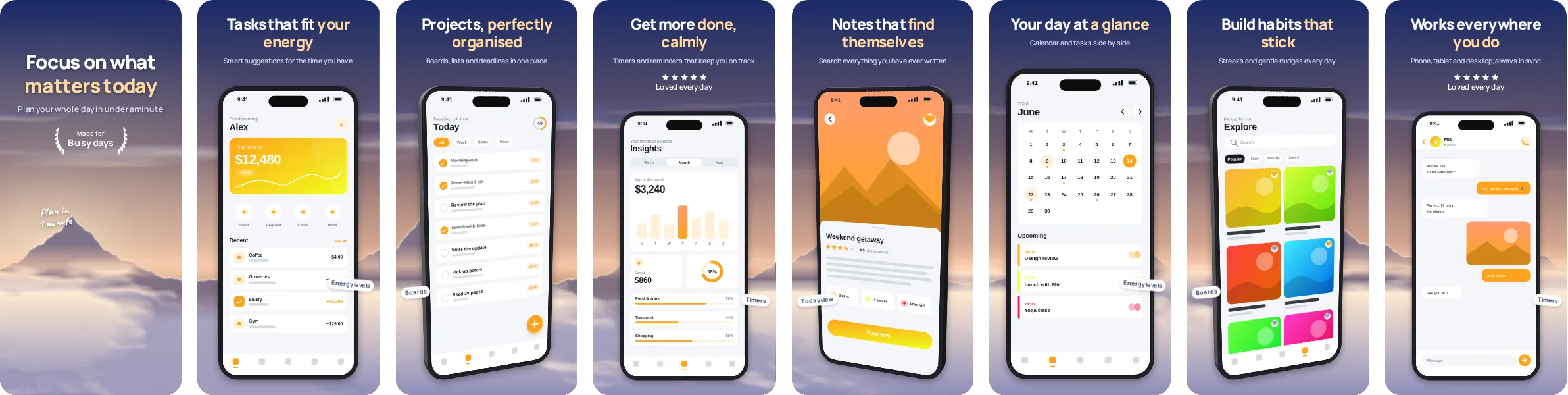
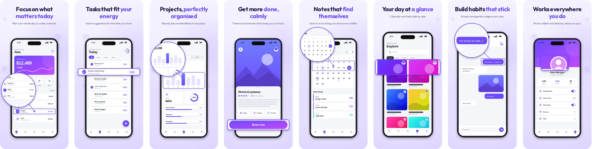
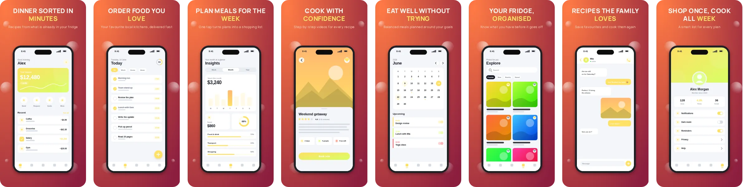
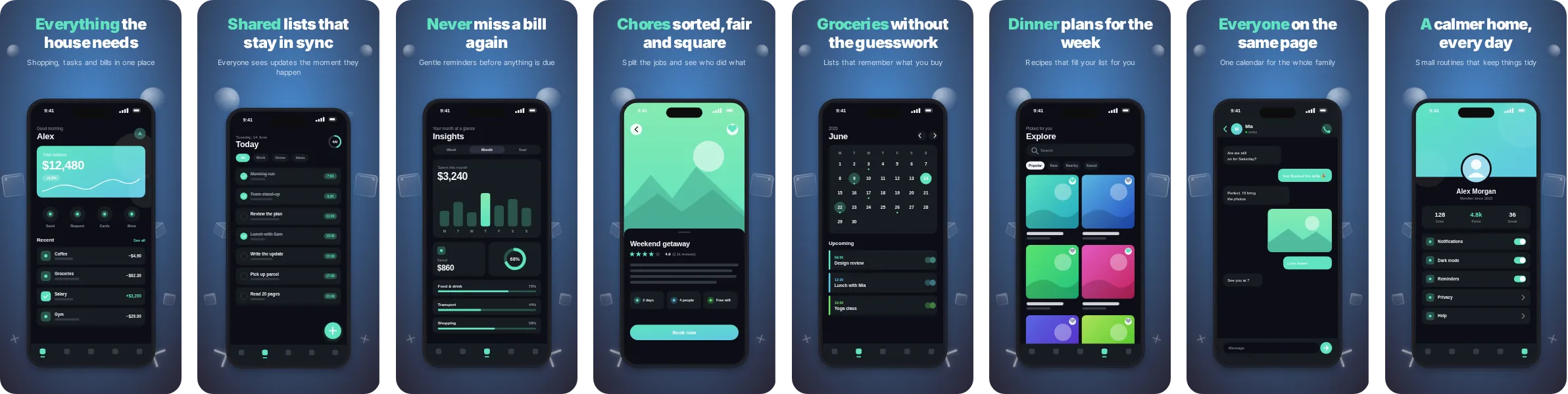
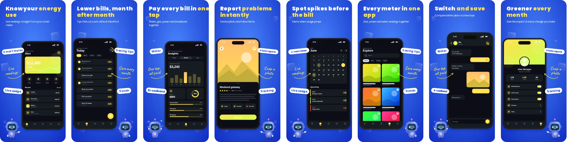
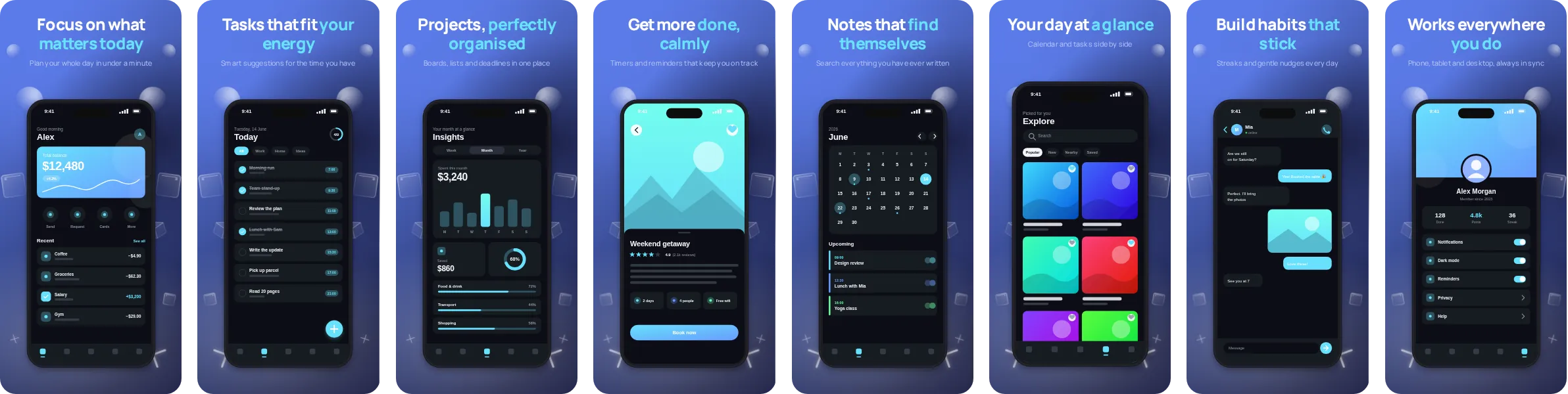
With Aurora the colour does a lot of the work. Blue leads the design, and the headlines are sized to be read at a glance, which suits a crowded store listing.
Aurora uses Manrope, a contemporary sans that stays sharp at small sizes. All 8 slides are editable: swap in your own screenshots, rewrite the headlines and adjust the palette, then export for both stores.
Aurora is a natural fit for productivity, notes and task apps, where the screens that sell the product are lists, calendars and focus screens and the message is about speed and order. It works just as well for other categories, so try it with your own screenshots before deciding.