About the Daybreak look
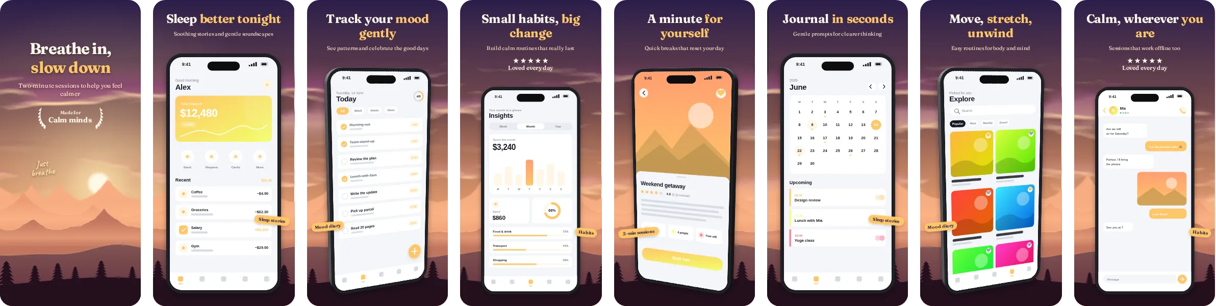
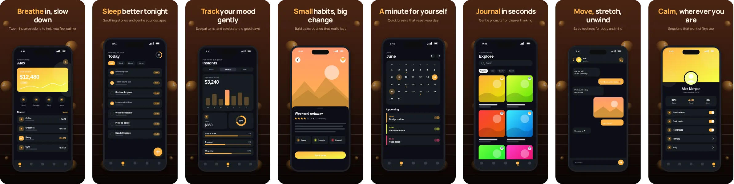
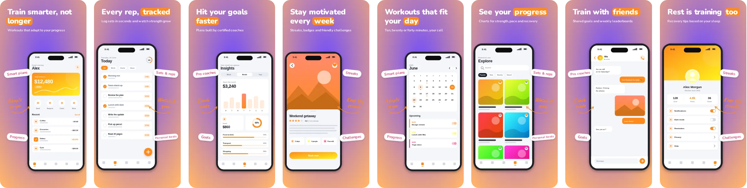
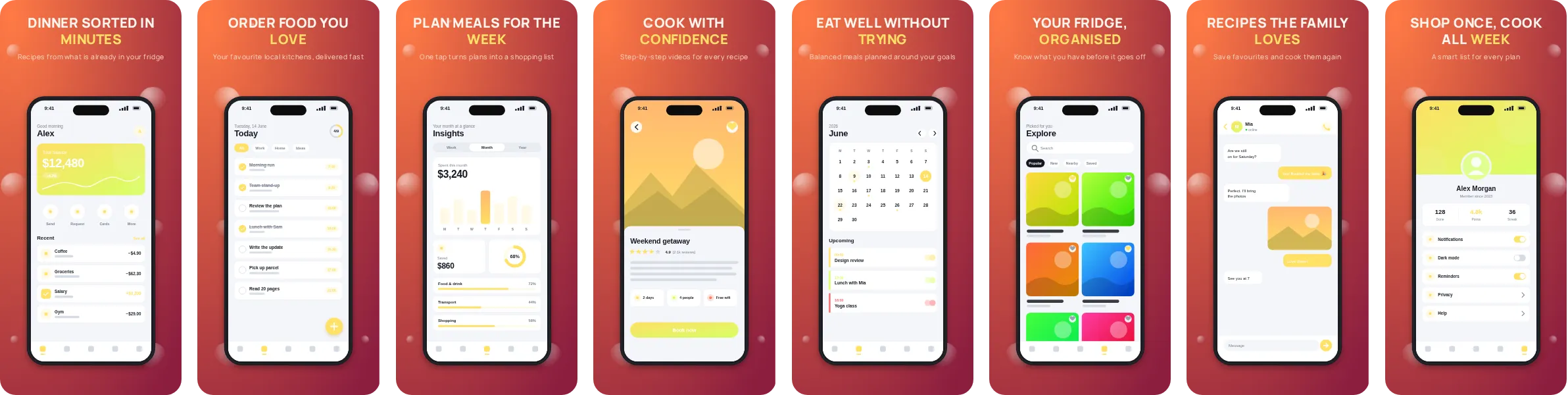
With Daybreak the colour does a lot of the work. Orange leads the design, and the headlines are sized to be read at a glance, which suits a crowded store listing.
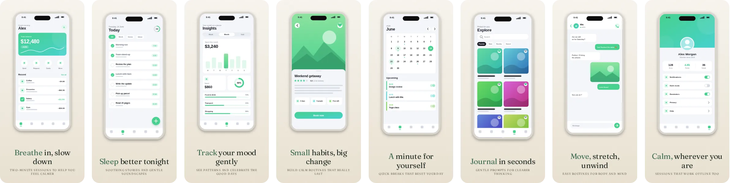
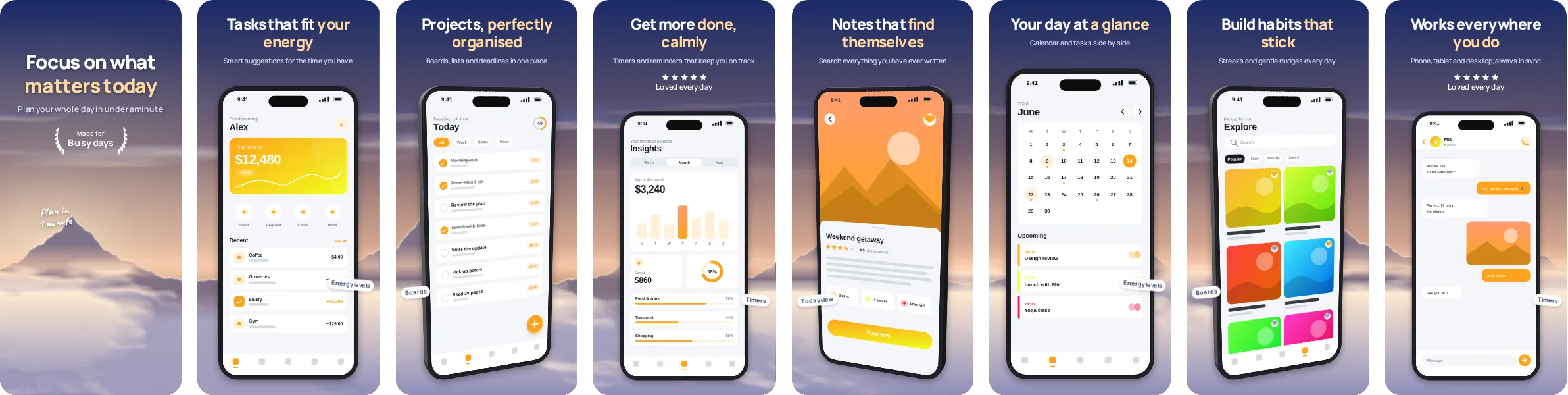
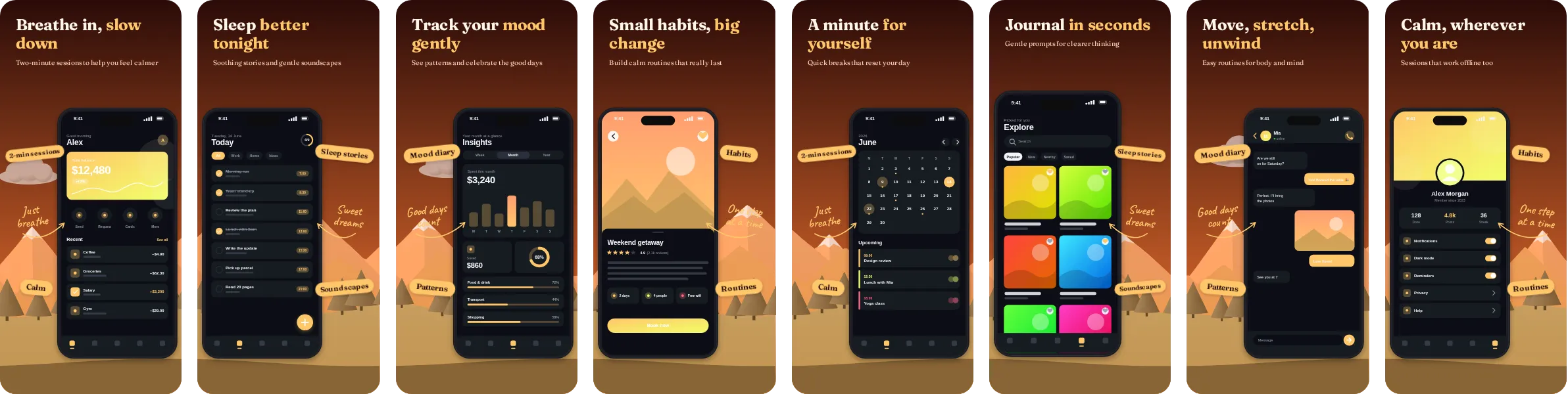
In Daybreak, the headlines are set in Fraunces, a serif display face that reads as calm and established. Each of the 8 slides pairs a short headline with a phone mockup, and you can change the wording, the screenshots and the colours in the editor before exporting.
If you build wellness, meditation and sleep apps, Daybreak shows calm routines, trackers and gentle reminders clearly and supports a message about calm and care. Other kinds of app work too; open it in Screentrino and see how your own screens look.