About the Lantern look
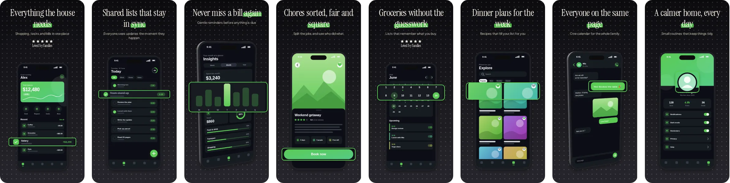
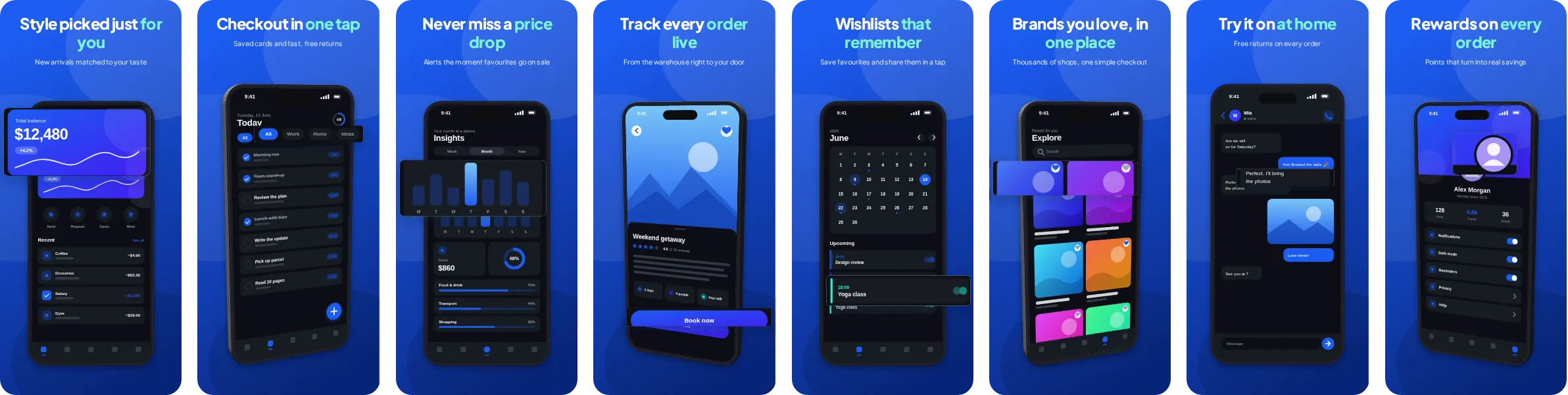
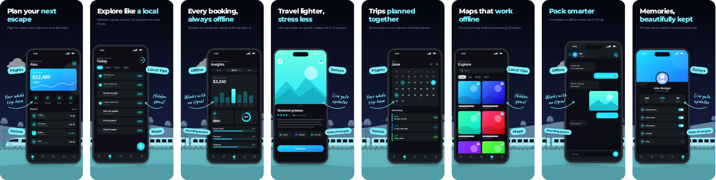
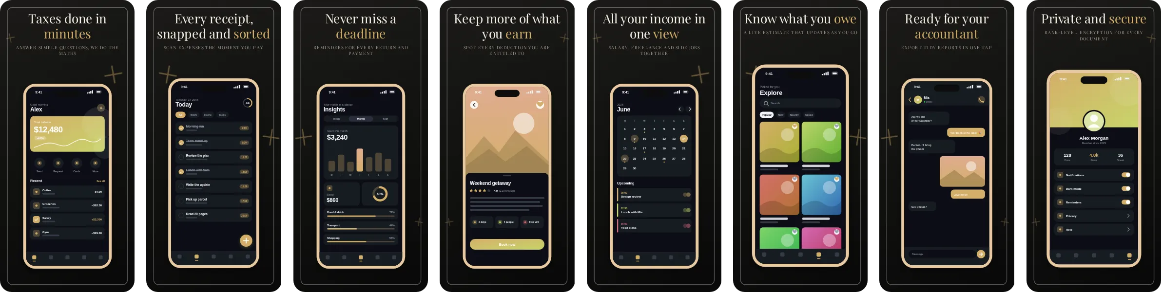
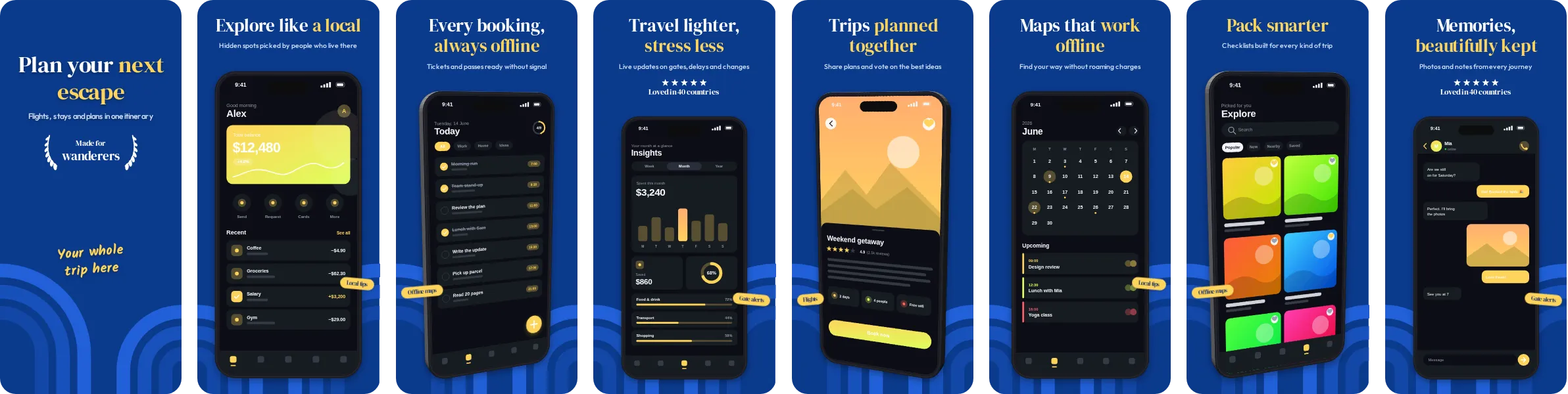
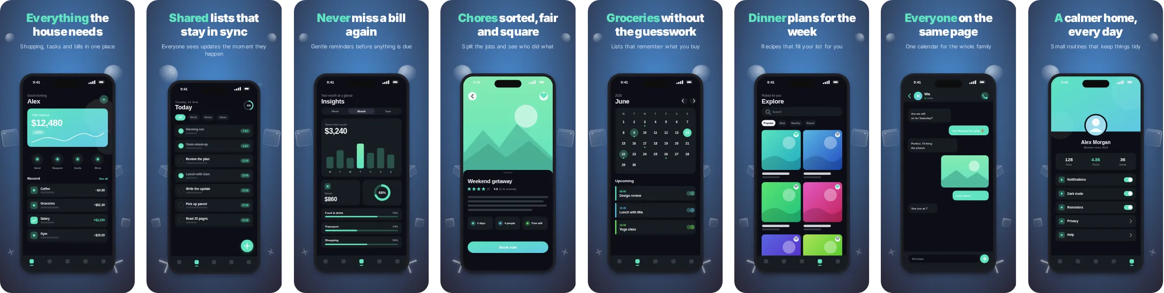
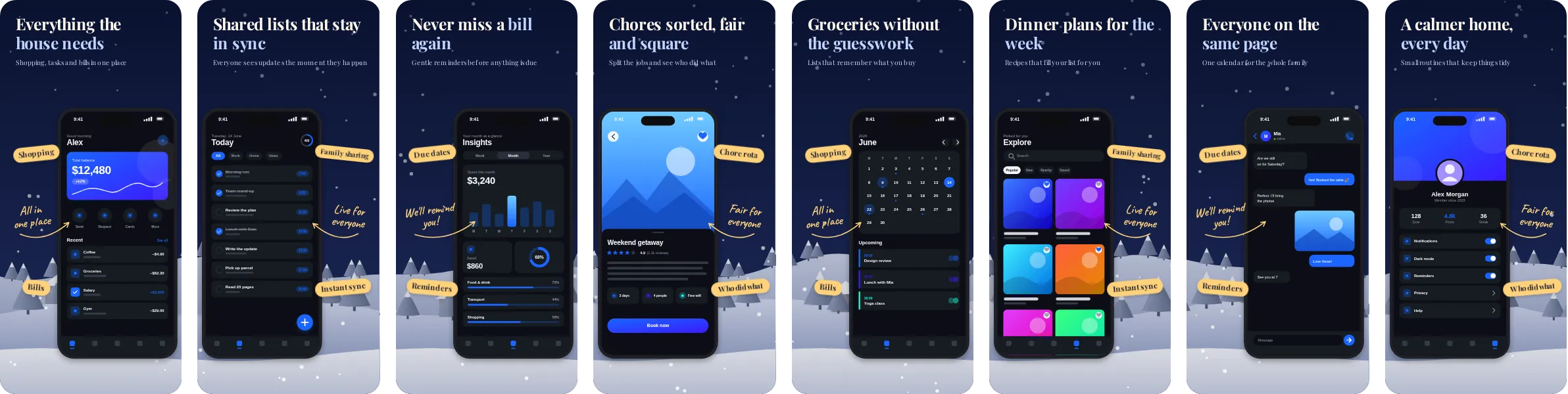
Start from Lantern when you want a dark set with a clear blue accent. The dark backdrop keeps attention on the screenshot itself, while the accent colour guides the eye to the headline and the key UI element on each slide.
Typography in Lantern comes from Playfair Display, a serif display face that reads as calm and established. The set has 8 slides, each with its own headline, so you can tell the story of your app in order: the main benefit first, then the features that back it up.
We use home, family and household apps as the sample wording for Lantern, because the layout handles shared lists, chores and calendars well and suits a message built on warmth and organisation. Nothing is locked to that category, and you can switch the sample text to match any app.