About the Press look
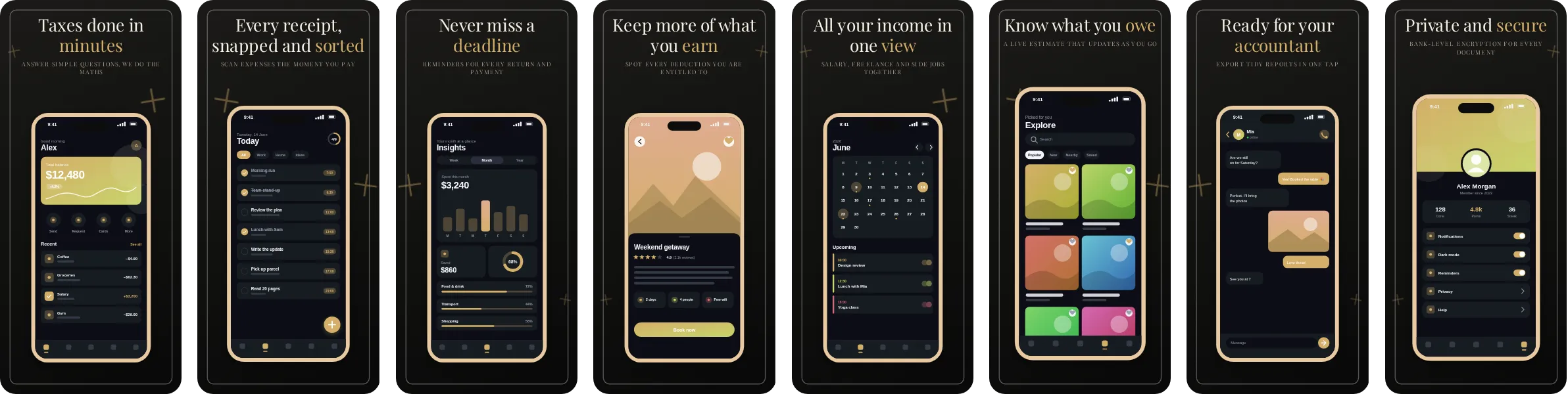
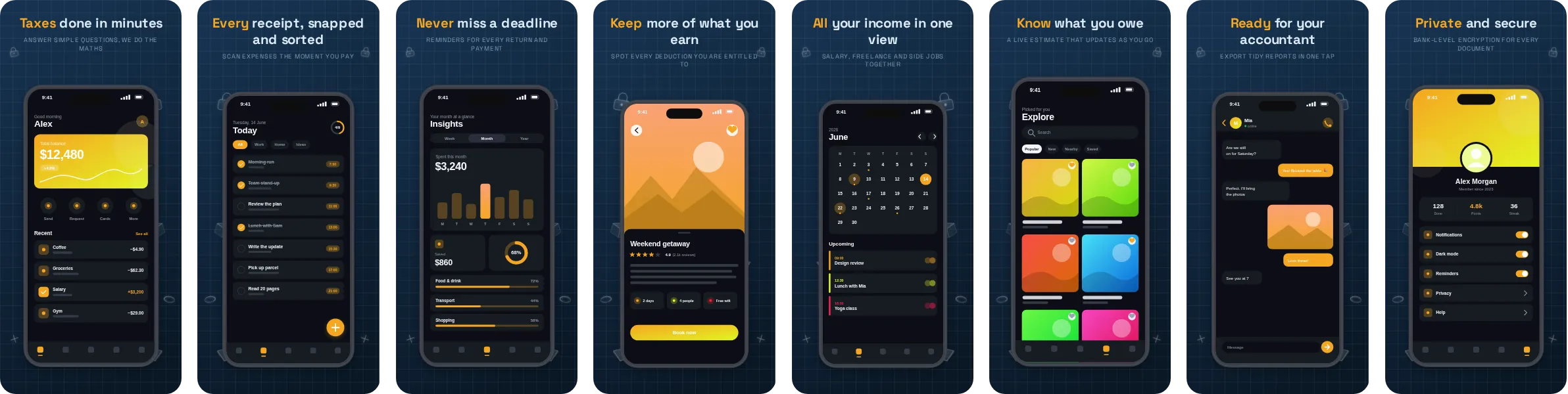
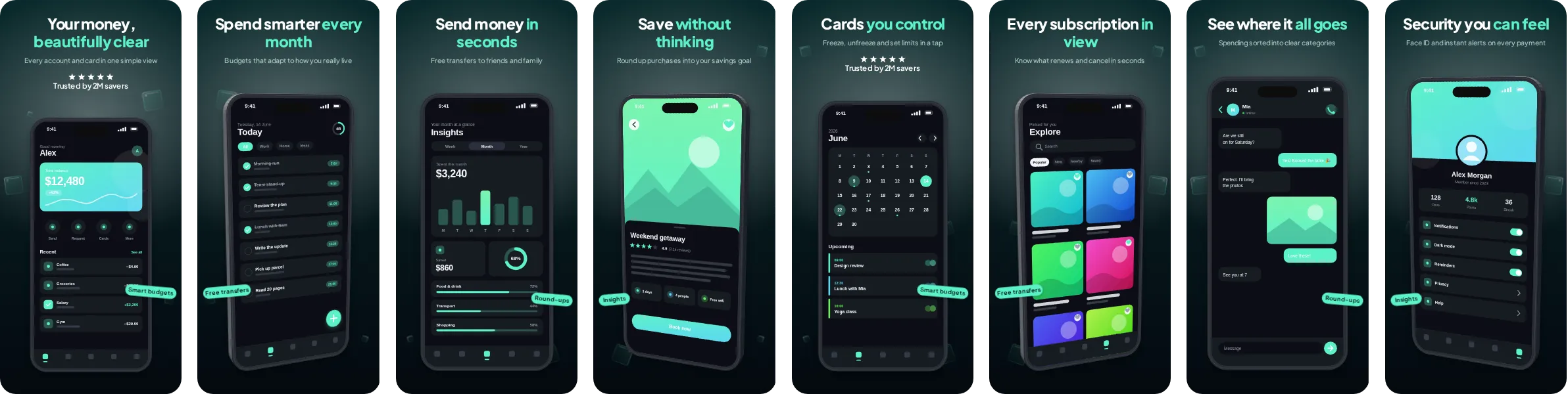
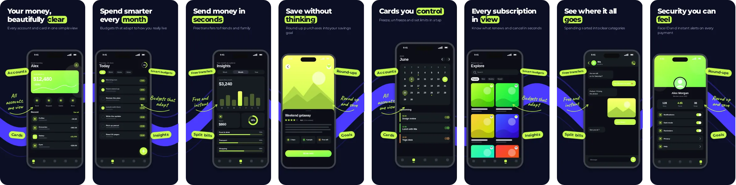
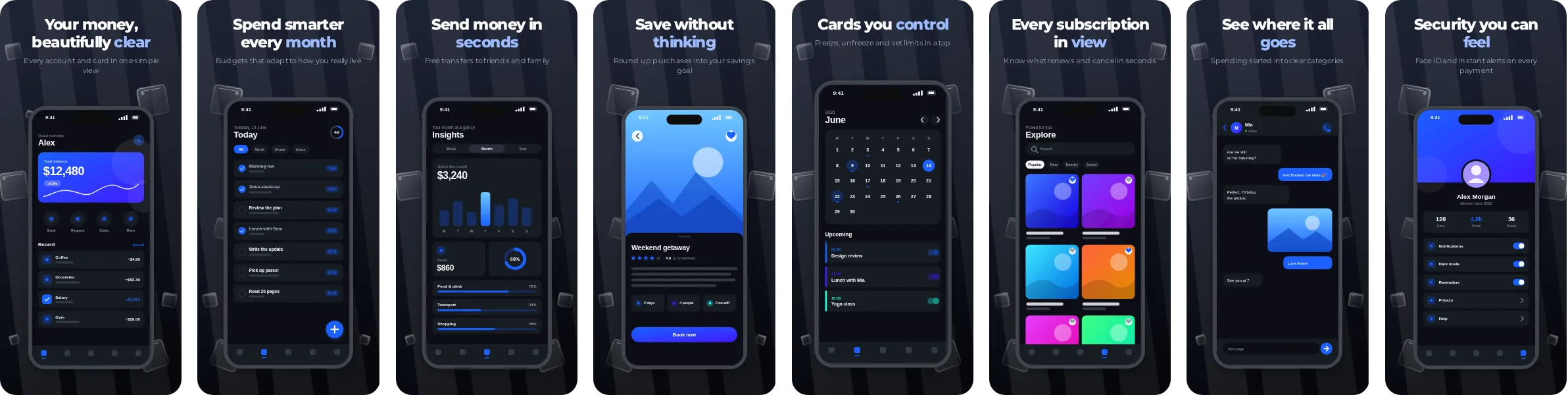
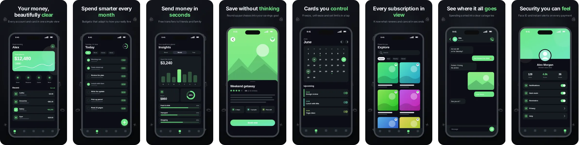
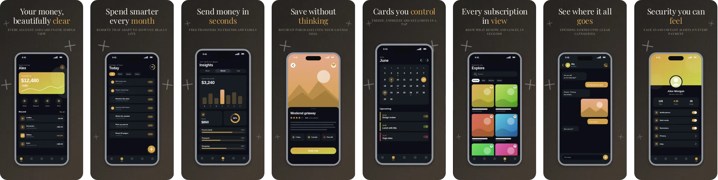
Press puts your app on a deep, dark background and uses amber as its signature colour. The result looks polished and slightly cinematic, and it makes the phone mockups stand out against the surrounding store page.
Typography in Press comes from Playfair Display, a high-contrast serif with a confident, premium tone. The set has 8 slides, each with its own headline, so you can tell the story of your app in order: the main benefit first, then the features that back it up.
If you build money, banking and budgeting apps, Press shows balances, charts and transactions clearly and supports a message about trust and clarity. Other kinds of app work too; open it in Screentrino and see how your own screens look.