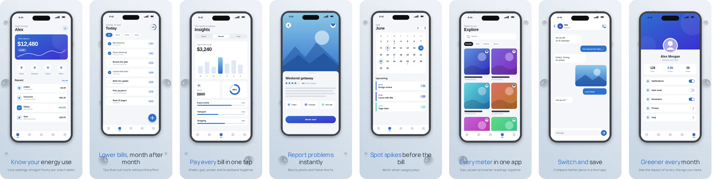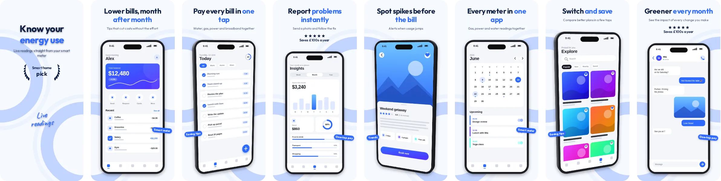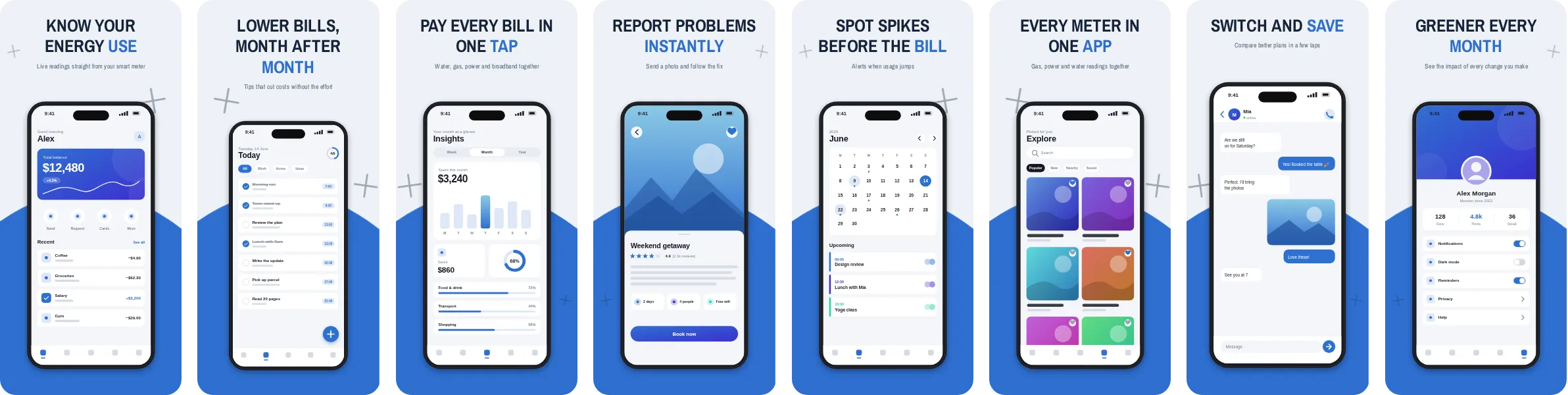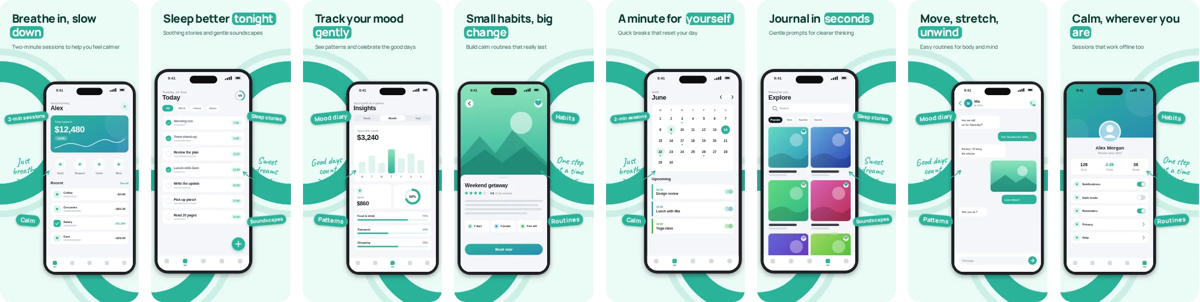
About the Frost look
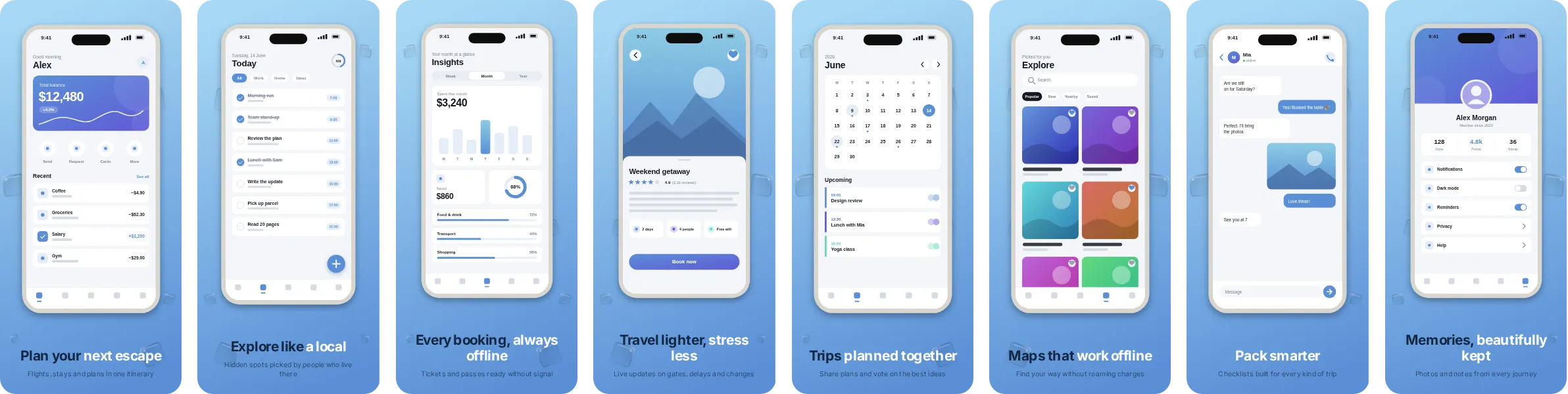
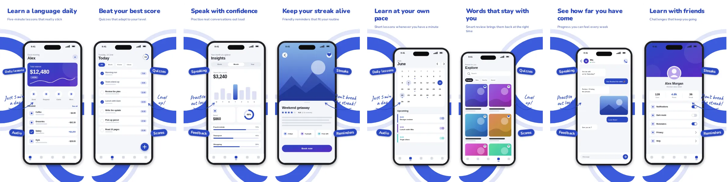
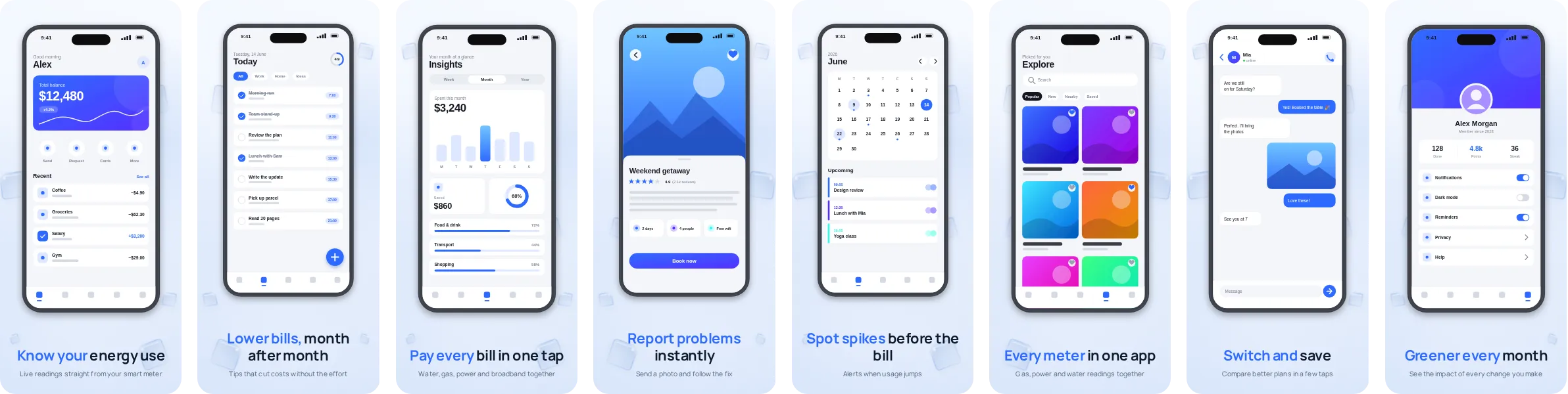
Frost sets your app on a light background and adds blue where it counts: headlines, highlights and call-outs. It is a good pick when your own interface is colourful, because the bright canvas does not compete with it.
Typography in Frost comes from Manrope, a contemporary sans that stays sharp at small sizes. The set has 8 slides, each with its own headline, so you can tell the story of your app in order: the main benefit first, then the features that back it up.
Frost is a natural fit for utility and tools apps, where the screens that sell the product are clear single-purpose screens and the message is about simplicity and reliability. It works just as well for other categories, so try it with your own screenshots before deciding.