About the Tidepool look
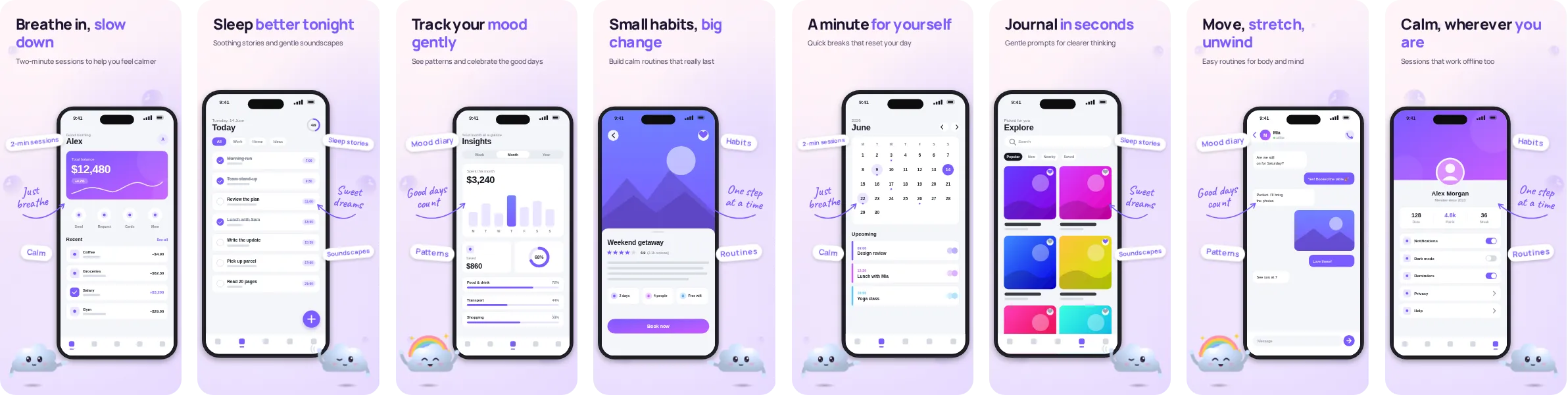
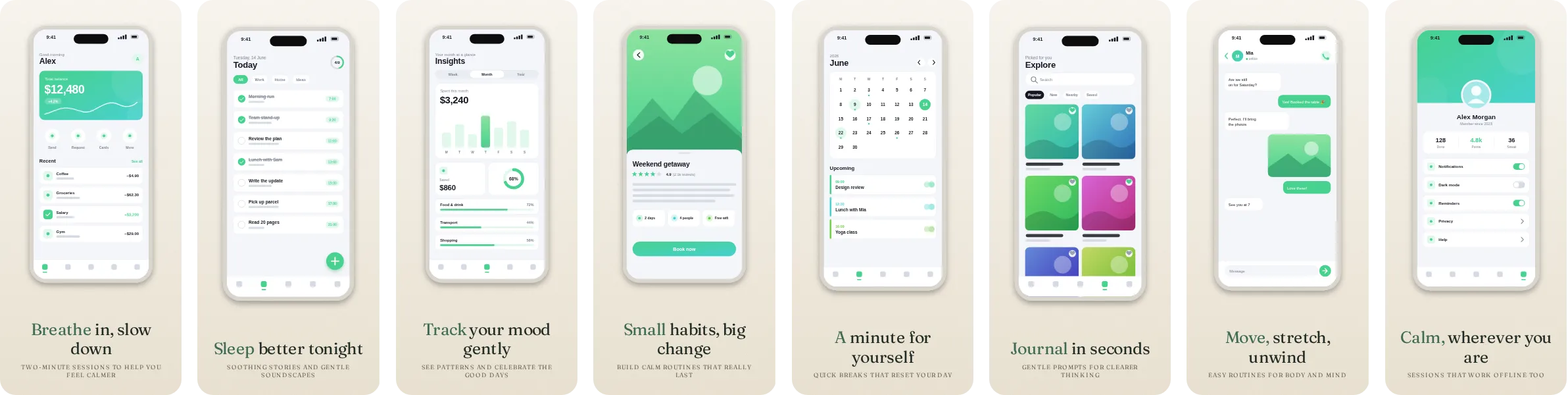
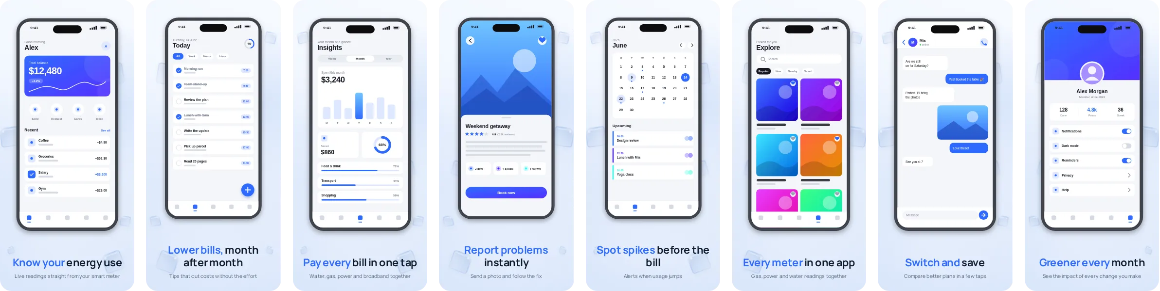
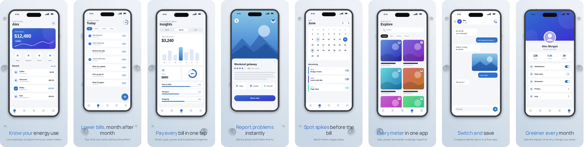
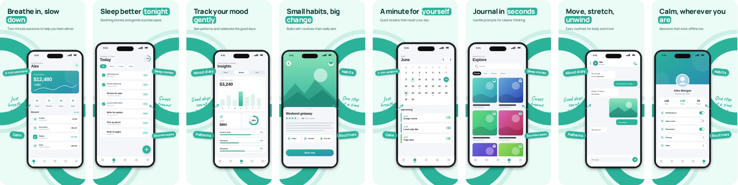
Tidepool sets your app on a light background and adds teal where it counts: headlines, highlights and call-outs. It is a good pick when your own interface is colourful, because the bright canvas does not compete with it.
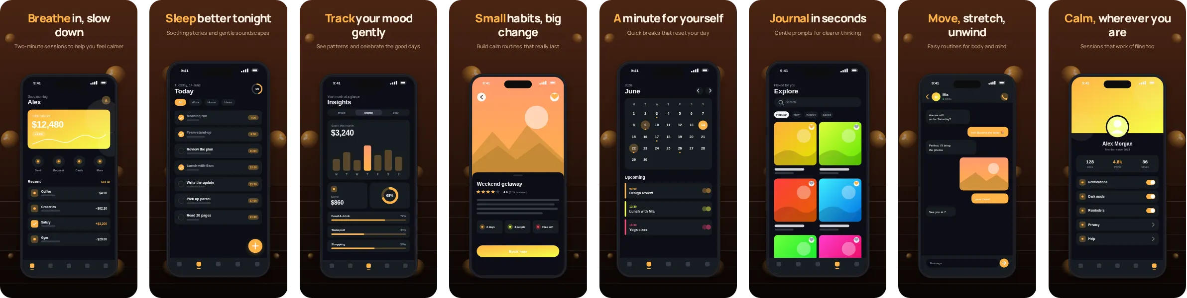
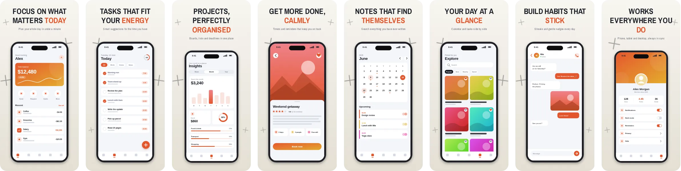
In Tidepool, the headlines are set in Manrope, a clean grotesque sans-serif with a slightly technical edge. Each of the 8 slides pairs a short headline with a phone mockup, and you can change the wording, the screenshots and the colours in the editor before exporting.
We use wellness, meditation and sleep apps as the sample wording for Tidepool, because the layout handles calm routines, trackers and gentle reminders well and suits a message built on calm and care. Nothing is locked to that category, and you can switch the sample text to match any app.