About the Neon look
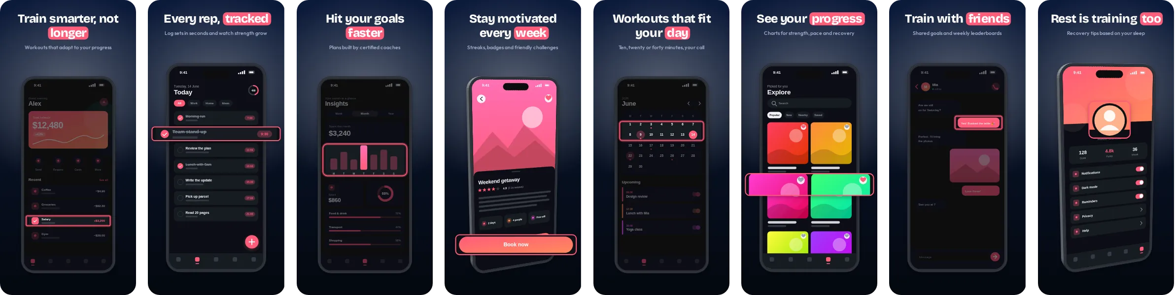
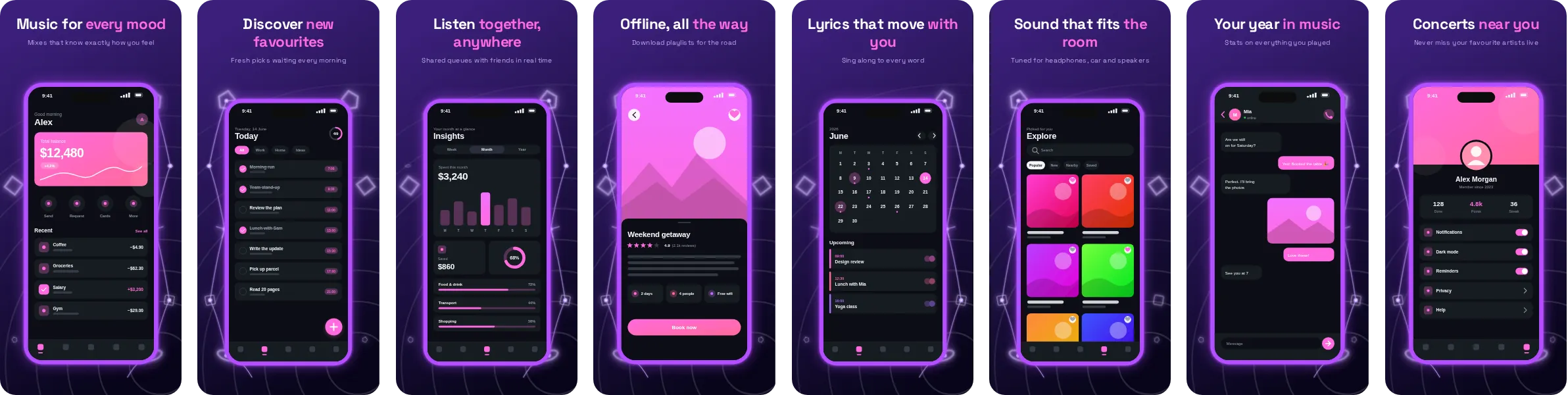
Neon puts your app on a deep, dark background and uses pink as its signature colour. The result looks polished and slightly cinematic, and it makes the phone mockups stand out against the surrounding store page.
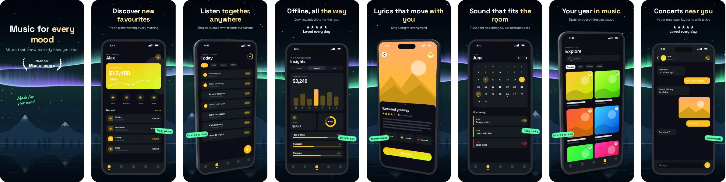
Neon uses Space Grotesk, a contemporary sans that stays sharp at small sizes. All 8 slides are editable: swap in your own screenshots, rewrite the headlines and adjust the palette, then export for both stores.
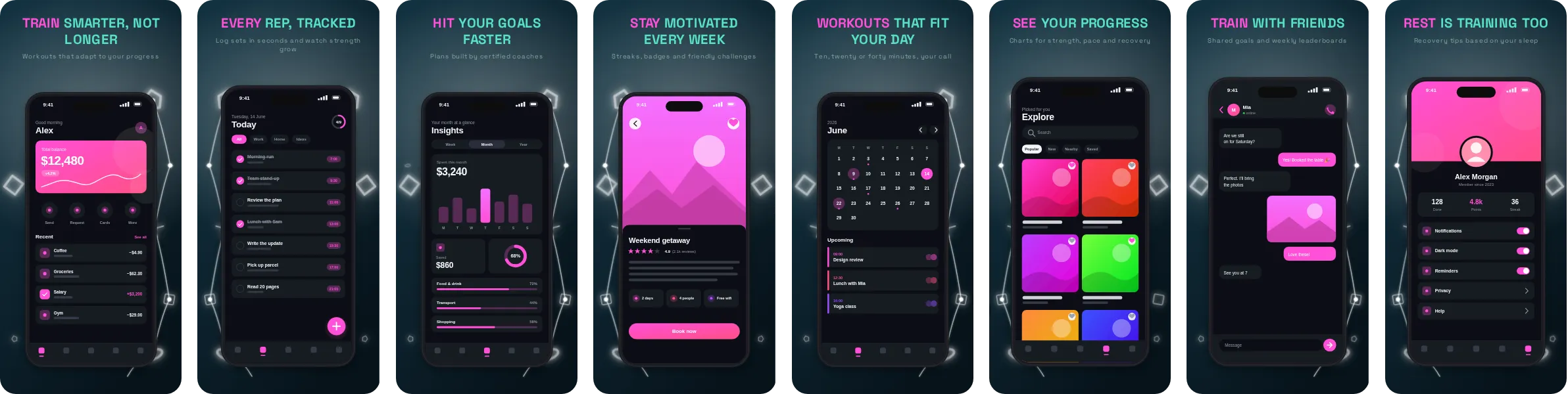
Neon is a natural fit for fitness and training apps, where the screens that sell the product are workouts, stats and goal rings and the message is about drive and momentum. It works just as well for other categories, so try it with your own screenshots before deciding.