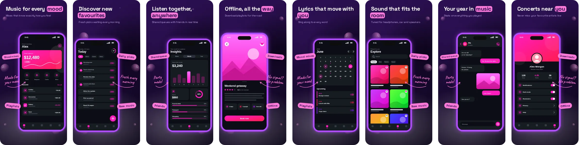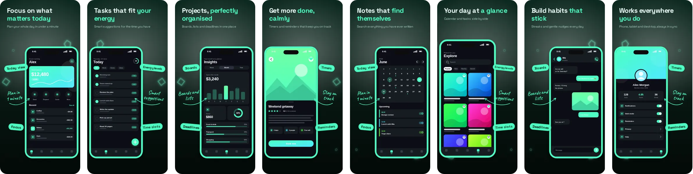
About the Neon Mint look
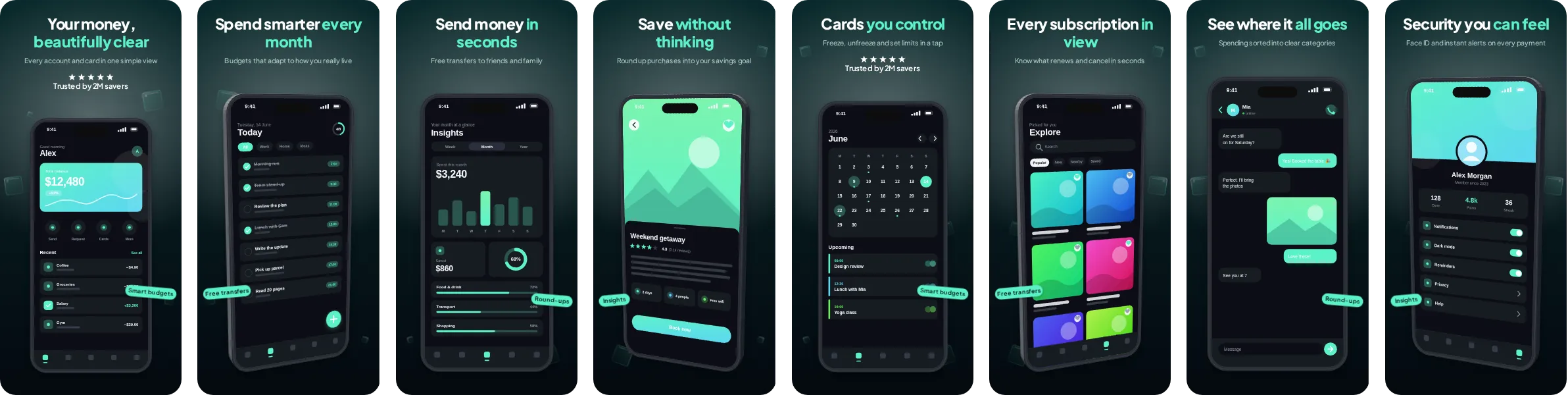
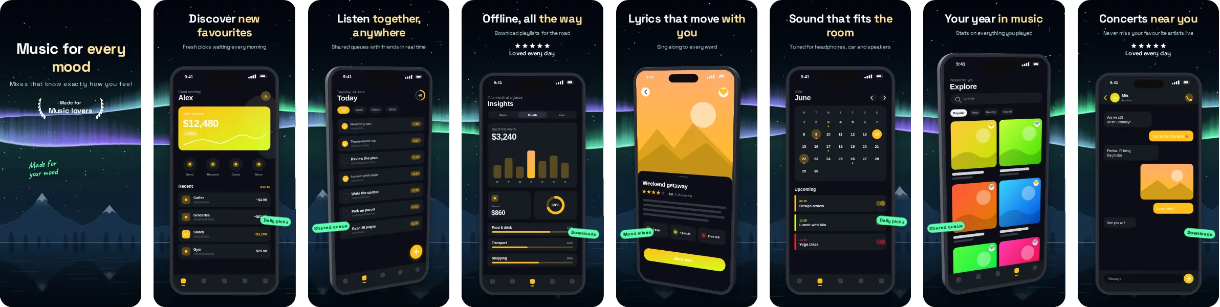
Neon Mint puts your app on a deep, dark background and uses green as its signature colour. The result looks polished and slightly cinematic, and it makes the phone mockups stand out against the surrounding store page.
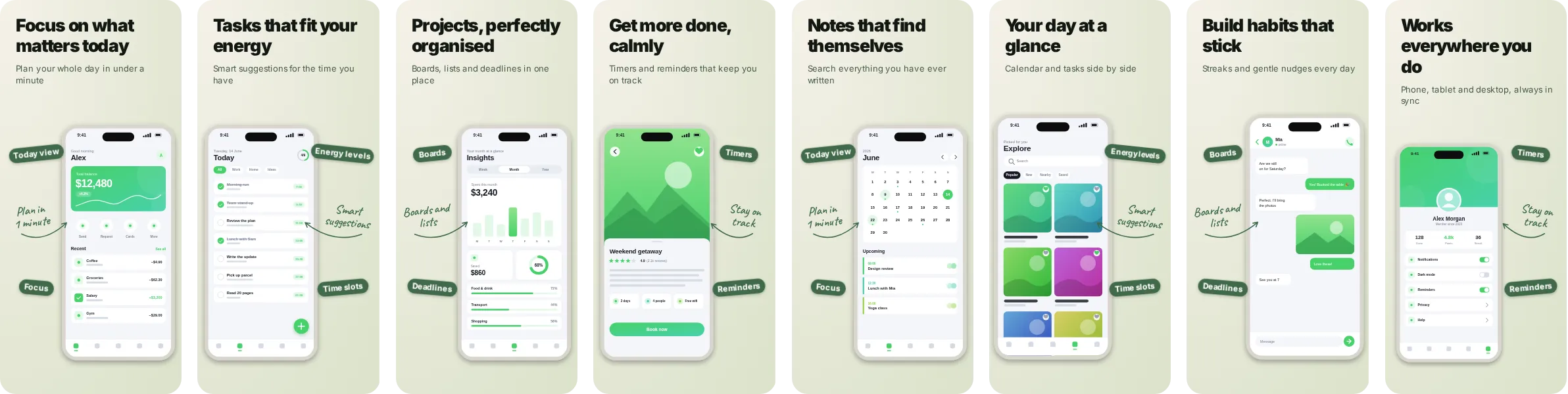
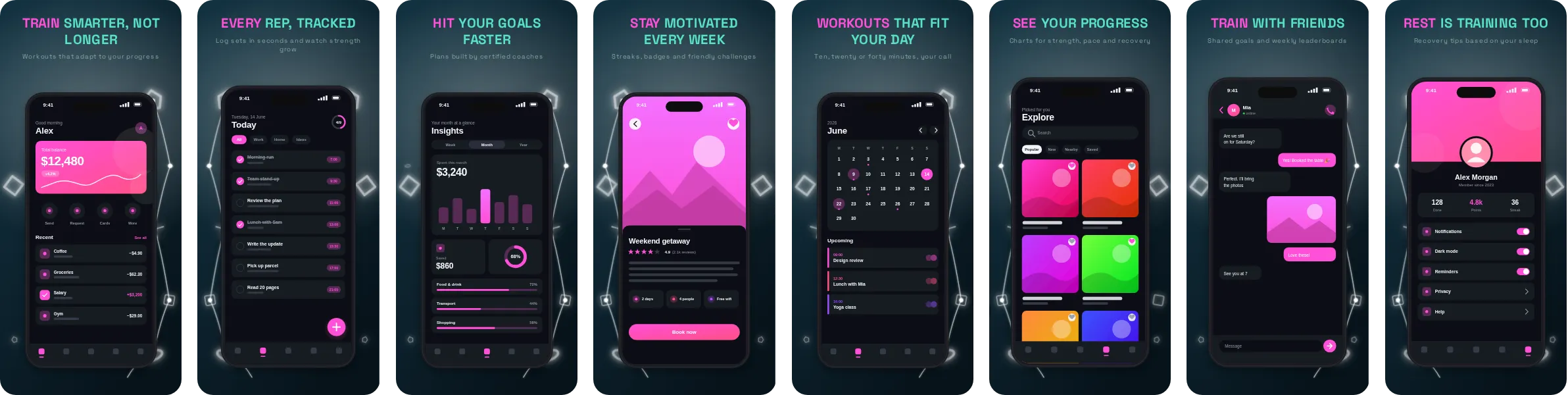
Typography in Neon Mint comes from Space Grotesk, a contemporary sans that stays sharp at small sizes. The set has 8 slides, each with its own headline, so you can tell the story of your app in order: the main benefit first, then the features that back it up.
Neon Mint is a natural fit for productivity, notes and task apps, where the screens that sell the product are lists, calendars and focus screens and the message is about speed and order. It works just as well for other categories, so try it with your own screenshots before deciding.